Summary
LocalEyez is a startup that focuses on aggregating a list of activities, specific to the user’s preferences. LocalEyez uses web scraping and machine learning to change the UI every week to accommodate the user’s preferences. However, they want to explore a different direction and move away from web scraping and explore a monthly membership that provides you with access to local experiences and events.
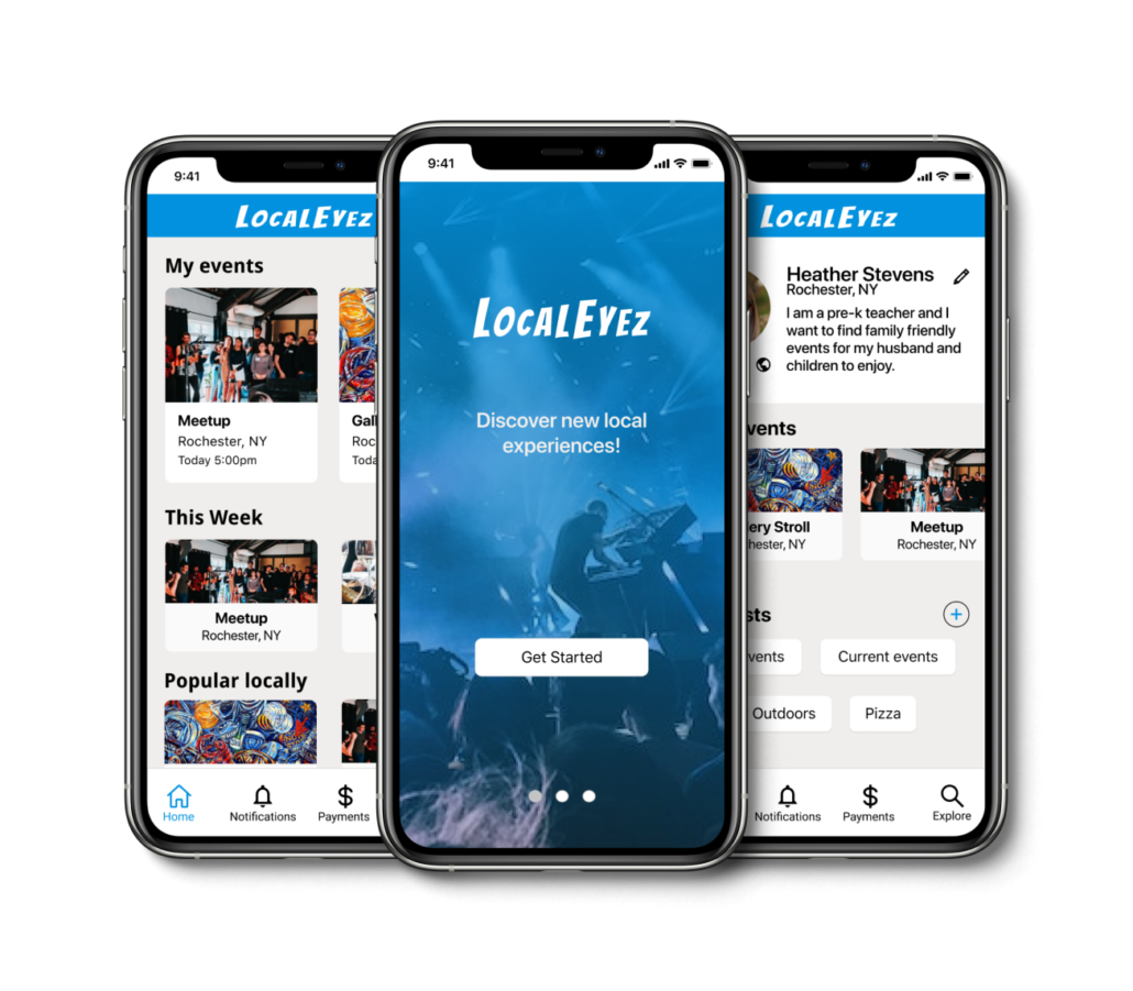
The directive for this project was to create the visual design for a mobile app based on the company website. Specifically the onboarding process, the home feed and a profile page redesign.
Problem:
LocalEyez needs to create a mobile app that works with their website. They need the following deliverables:
- Onboarding screens
- Home feed
- Profile page
Solution: A mobile app that has the same information as the website with a clear onboarding process, a personalized feed and profile screens.
Scope & Constraints
The scope of this project was to create a user flow with an onboarding process, an event home page feed and a profile page. The main constraint was the limited time of one week.
Design Roles
UI Designer
Design Deliverables
UI Design
Wireframes
Prototype
User Testing
Visual Design
Design Approach
Much of the research had already been done for this project. The task was to create specific screens based on the research. The approach was to review and become familiar with the research, analyze the website and create wireframes and prototypes for key screens.
Our Users
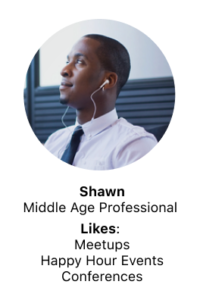
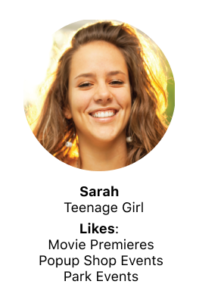
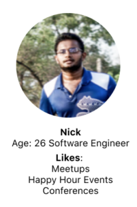
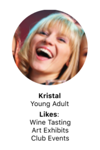
Our user and audience consists of a wide range of people. We have 5 personas we are designing for. The users are diverse ranging from a teenage girl to a middle-age professional. The common interests are that they all want to find local events.
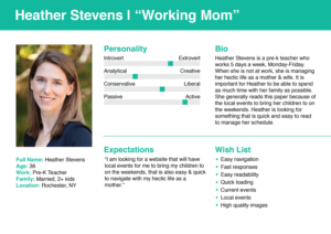
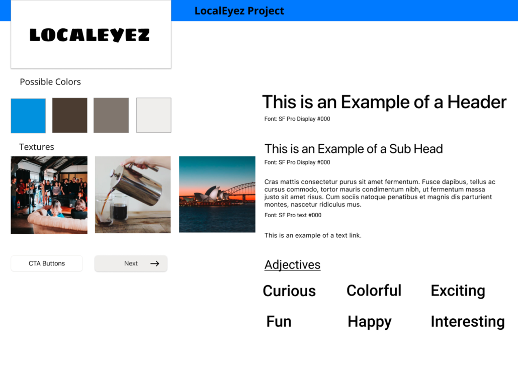
My first step was to review the research that I was given and create a pattern library, style tile and user flow. I chose one persona to focus on as I created my initial user flow. She is a pre-k teacher and wants to find events for her family.
Define
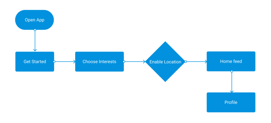
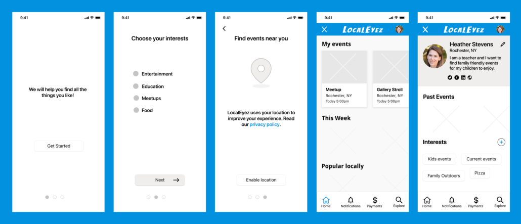
Information Architecture: I created a simple user flow based on the clients needs. We wanted the user to have a simple onboarding experience, view the homepage feed and view her profile.
Wireframe
Wireframing: With my user persona and flow in mind I began creating wireframes for the onboarding screens, the feed page and the profile page.
Develop
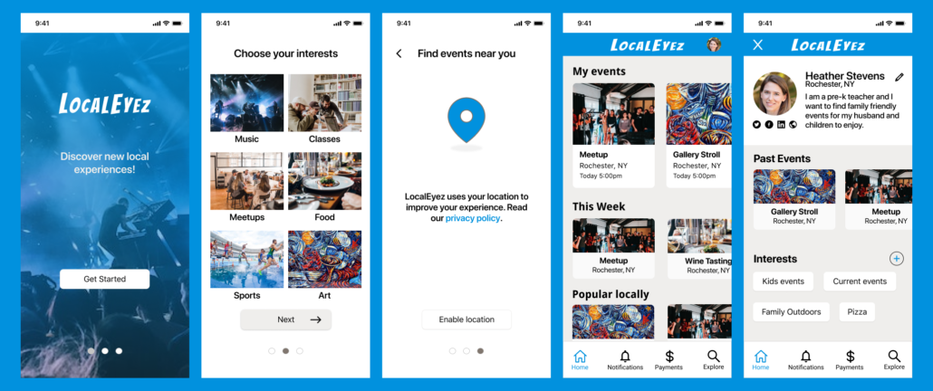
Visual Design: After creating wireframes and receiving feedback I began to transition from the wireframes to the visual design. I chose colors and fonts based on the companies research and added more detail to the design.
Deliver
Prototypes: With the visual design complete I then started prototyping using Figma. I began connecting screens and adding appropriate animations to complete the prototype.
Outcomes
Outcomes: I solved the problem by creating the required deliverables. An onboarding process, a home feed and a user profile screen. I created a prototype that allows the user to achieve their goals in finding current local events.
Learnings – I learned to work on a project that is in progress and to add my skills to create a simple and elegant solution.
