Summary
Our client Astroblack is an e-magazine devoted to Afrofuturism and empowerment through cultural awareness.
Afrofuturism is a movement in literature, music and art that features futuristic or science fiction themes which incorporate elements of black history and culture.
Problem: We found a lack of organized resources for anyone who wants to learn about afrofuturism.
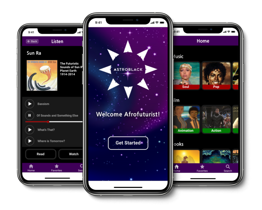
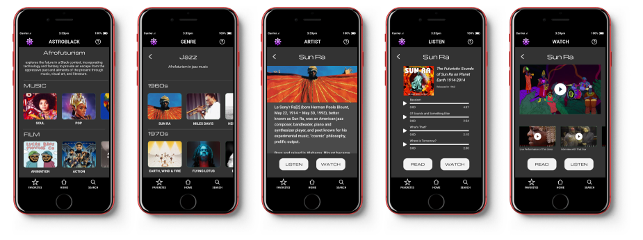
Solution: A mobile app that makes it easy for anyone interested in afrofuturism to get information, see examples and to become more educated about the subject.
Design Roles
Team Lead
Sticher
Design Deliverables
User Surveys
Personas
User Stories & Flows
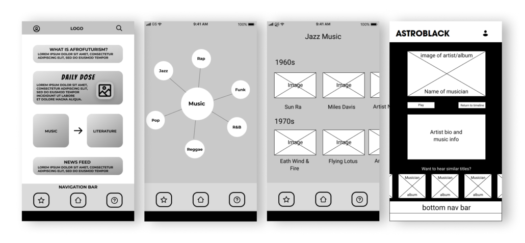
Wireframes
Prototype
User Testing
Visual Design
Design Approach
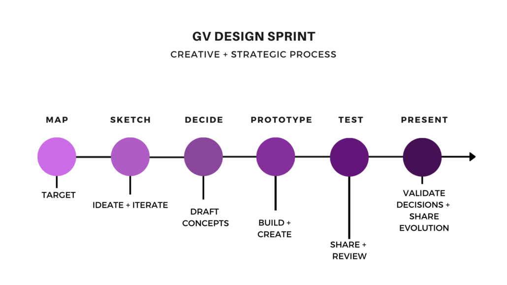
GV Sprint: Our design approach was to use the GV (Google Ventures) Sprint process. This process is used to create a testable prototype in a short amount of time. Typically this takes one week, we did our sprint over the course of 3 weeks so we had time to learn.
Why, Who and What?
We began the discovery phase by interviewing our client and asking the key questions why, who and what.
Why are we doing this?
To provide a single resource that will educate users about afrofuturism and increase social awareness.
Who is the user?
College students, life long learners, sci-fi fans, artists and creators.
What will we include in our product?
Audio assets such as music and podcasts.
Visual assets like film clips, animation and motion graphics.
Literature assets like books, magazines, comics and articles.
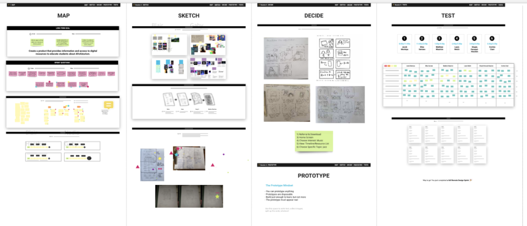
Tools: We used a virtual whiteboard using a tool called Miro to collect and organize the information. This is a template for the sprint process. It really helped us look at everything in one place and make quick decisions.
We also used Figma for prototyping.
Personas:
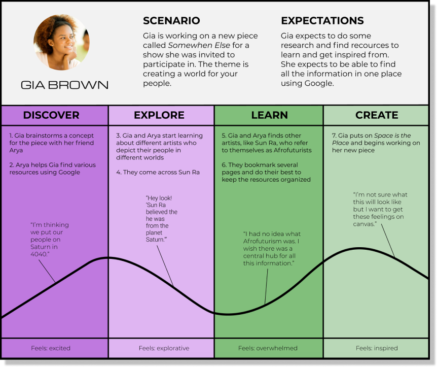
We created proto-personas based on the information we got from our client and the experience and knowledge that the team members had. We chose the best one and created user experience maps based on that.
User Mapping:
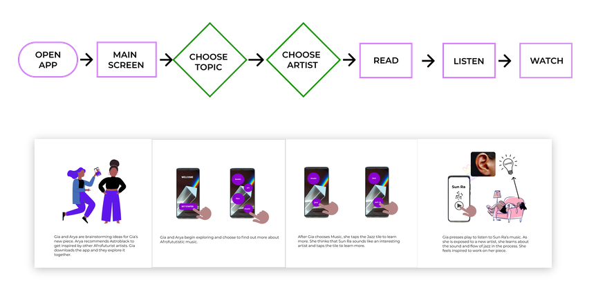
We created a journey/empathy map to show how our user would solve the problem and how our app would be useful to her.
Define
Information Architecture: We developed a specific user flow based on our initial research with the client.
Wireframe
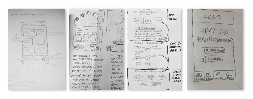
Wireframing: Once we gathered ideas and inspiration we started sketching. We sketched individually and decided on the best ideas as a team. We used tools and exercises like lightning demos and a 4 step sketch which consists of individually taking notes, sketching rough ideas, playing a game called crazy 4s and then finally sketching a final solution sketch to define our designs. We voted on the best options, combined them into one and started to prototype.
Develop
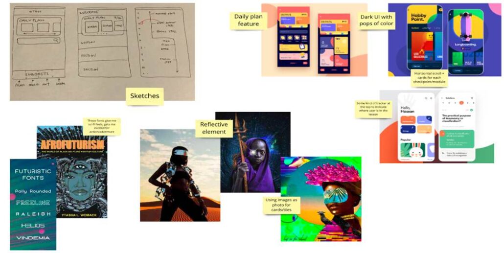
Visual Design: We gathered images for inspiration to add to our Miro virtual white board and started creating the visual design based on some of the images we felt were appropriate for our product.
Deliver
Prototypes: We created a prototype using Figma and created the look of the app based on our branding guidelines.
User Testing
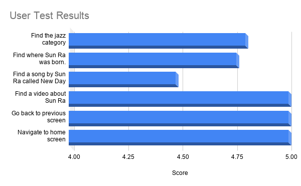
Testing: We found six users to help us test our product. We interviewed them using Zoom and we asked them a series of questions to get to know them. We then had six tasks for them to accomplish while we observed as a team. Finally we asked them questions about how they feel using the app and what improvements they might like to see.
User Testing Results
Testing: We used a scale of 1 – 5 to rate our users. Our users all scored over 4 on all tasks. The most difficult task was finding a song by the artist. One user wanted to search for it, another couldn’t understand to scroll down a screen. Generally the app was easy to navigate.
Outcomes
Outcomes: We solved the problem by creating this app prototype. Our app makes it easy for anyone interested in afrofuturism to get information, see examples and to become more educated about the subject.
We created a mobile app prototype that provides an equitable resource of information for afrofuturistic media. This app can also be applied to other subjects.
Learnings – I learned how to work with a team, how to focus on a single goal and how to keep a design simple.
How I will use this information in the future – I will continue to simplify my designs and make designs accessible to all users.
Results: We were able to produce an effective solution to our client.
What worked – We worked well as a team and utilized each team member’s strengths.
What didn’t work – We didn’t get as many survey respondents as we had hoped.
Doubts going into the project – We were not sure if we could show the results in a simple and effective way.
Surprises – We were surprised that some of the users missed some parts of the tasks.
What would we do differently with more time – We would have changed some of the design.

