Summary
The Learn More App was designed for Valencia Tutors to provide a product that will help parents, students and teachers communicate about assignments, grades and assistance. Valencia Tutors offers tutoring services, college planning, SAT/ACT test prep and over 40 accredited high school classes in English, Spanish, math, science and social science. The majority of classes are held online due to COVID-19.
Problem:
Students and teachers have trouble communicating efficiently with virtual learning.
- Students don’t have an easy way to be organized with their studies.
- Teachers want to have an efficient way to communicate with students.
- Parents want to see progress at a glance.
- Administrators want to create a good learning experience.
Solution:
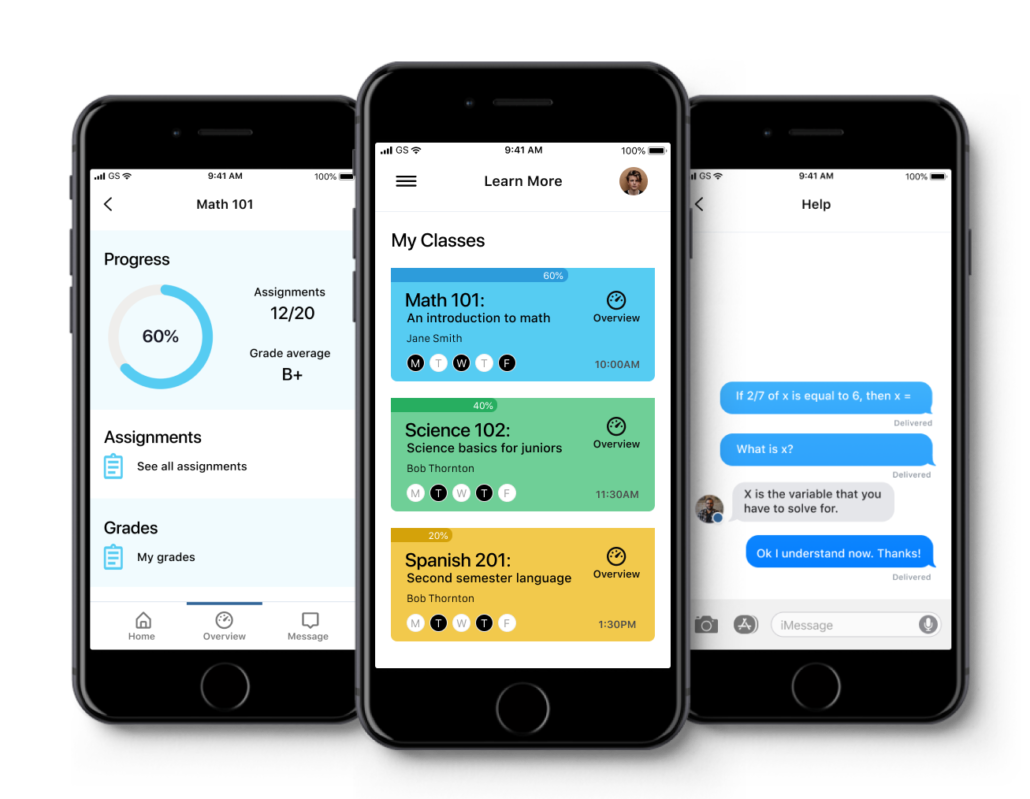
I solved this problem by designing a mobile app that allows the student to work on assignments, see their progress and communicate easily with the teacher. The main communication method is an integrated direct messaging system.
Scope & Constraints:
The scope of this project is to create a MVP that allows students to work on assignments, get help from the teacher through direct messaging and to find their overall progress. The constraints are time and budget resources. The time was limited to three weeks and there was no budget for research.
Design Roles
UX Research
UX Design
UI Design
Visual Design
Design Deliverables
User Surveys
Personas
User Stories & Flows
Wireframes
Prototype
User Testing
Visual Design
Design Approach
Client Survey:
I started the process with a client survey. I wanted to know why we wanted the app, who will be using it and what the features are.
Q. Why do we want an app and how will this help the business?
A. The app will help parents , students and teachers communicate efficiently and allow the parents to see the students progress.
Q. Who will use this app?
A. Students, teachers and parents.
Q. What does the app need to do?
A. The app needs to allow students to work on assignments and get help easily. It also needs to provide an easy way to find the overall progress including grades, assignments and any school announcements.
Client Interview
I followed up the survey with a client interview. I was interested in learning about their current methods of communication and how their learning process works.
- They work with students based on short and long term goals according to the student’s specific needs.
- Some parents want help with a skill, while other parents want help with homework.
- Teachers communicate with students through email and an app called Schoology.
- The main problem with Schoology is that it is difficult to set up and the communication is slow.
- The Schoology login link expires causing frustration.
User Survey
The next step in my research process was to get information from potential students and parents.
I created a survey using Google Forms and gathered these results:
- The most common method of communication is email.
- There is not a uniform method of communication. Each teacher chooses their own method.
- The most common communication apps are Remind and Canvas
- The most common problems are miscommunication and unreliable methods.
- The usability of current systems are rated from 50% easy to 0% difficult.
User Interviews
I interviewed 3 parents with their children and found the following:
- Parents wanted a better way to communicate with the teachers
- Students would like to have a way to send direct messages within an app
- Parents want to be able to see the students progress easily
Competitive Analysis
I looked at some of the popular competitors. I found that the main competitors are Google Classroom, Schoology and Remind.
I implemented these features based on my research:
- Create a simple home screen.
- Allow students and parents to see grades and progress.
- Allow students and teachers to use direct messaging within the app.
Personas:
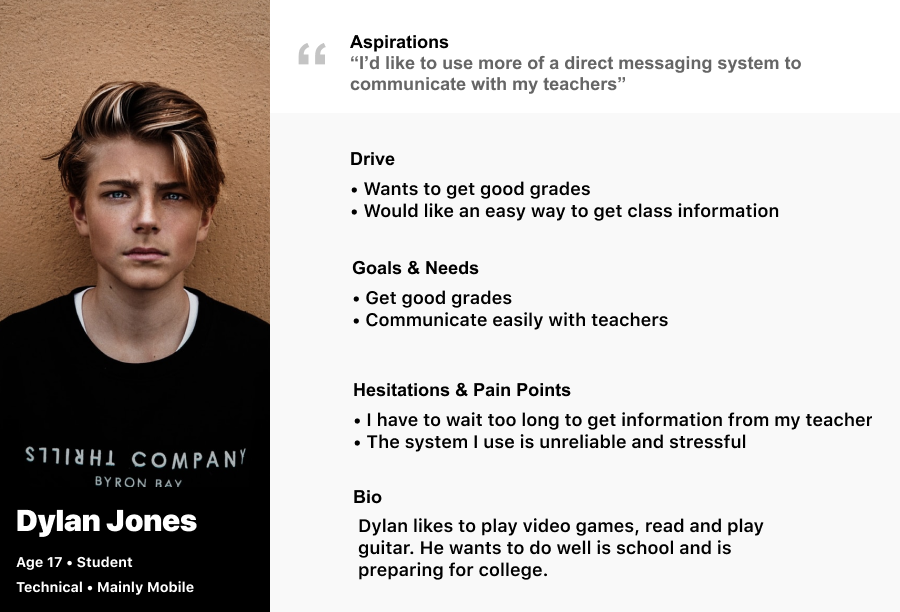
I created two personas based on my user research. The first one is based on parents and the second one is based on the student.
User Journey
The next step was to consider the user’s journey. I began by creating user stories and then user flows.
User Stories:
- As a student I want to be able to get help with my homework without waiting too long so that I can keep up on my classwork.
- As a student I want to check for new assignments so that I don’t get behind.
- As a parent I want to check on my child’s progress so that they don’t get behind.
- As a teacher I want to be able to communicate with my students easily so that they will be up to date.
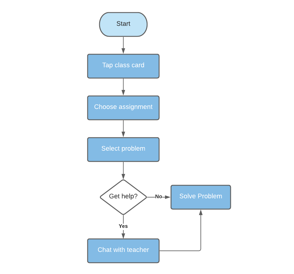
User Flows: I created several different user flows and chose the one with the highest priority to focus on.
Define
Wireframes
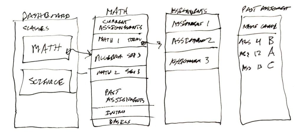
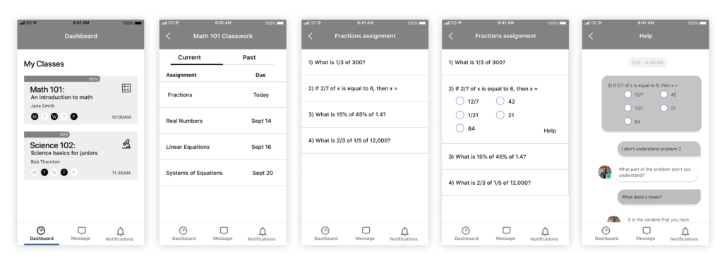
The information architecture phase started with wireframe sketches. I used a pencil and paper to sketch out my user flows as wireframes. After some iterations I was able to create digital wireframes based on the sketches.
Brand Identity
The name of the product is LearnMore.
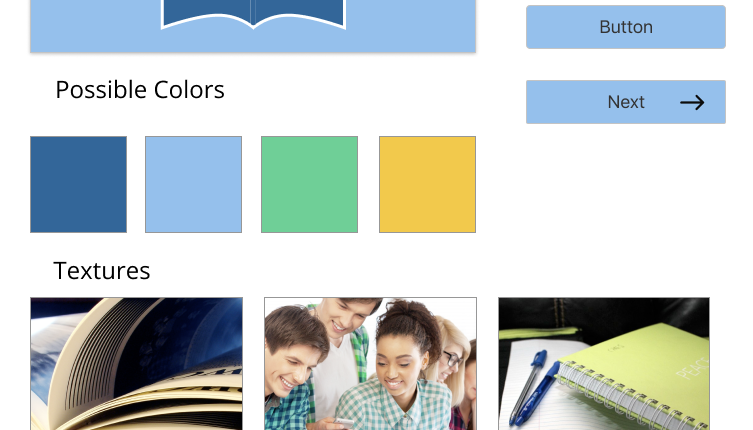
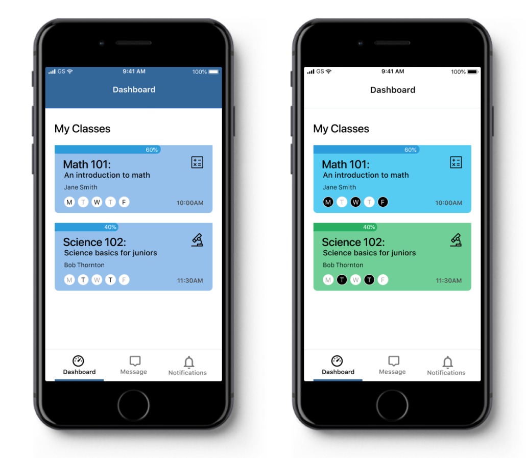
The brand identity was based on a combination of the current brand for Valencia Tutors and the desire to communicate a sense of calm and happiness to the users.
Bright blue and green colors were chosen to convey a positive experience. Apple’s SF Pro typography was chosen for its familiarity.
Preference Testing
I created a preference test at usabilityhub.com to get feedback on my design. I found that 78% of users preferred the second screen over the first.
Develop
Prototype
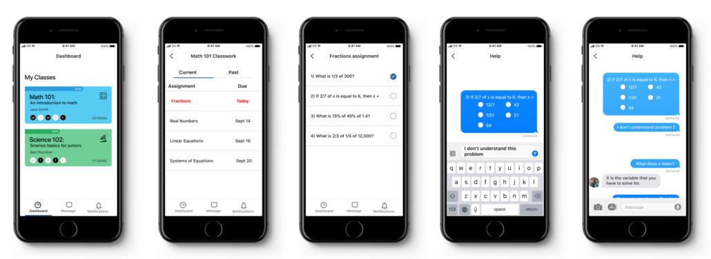
I created a prototype based on my wireframes and added the brand identity. The first prototype was created for the following user flow:
Student opens the app > wants to look at today’s assignment > reads through assignment > has questions > messages questions to teacher.
User Testing
I then began testing this flow using Maze. The first issue that I found was that some users wanted to try to solve the problem in the help screen. I redesigned that screen by removing the answers.
The second issue that I found was that some users were confused about the assignment list screen. It was not apparent to click on the assignment to expand it. I removed one screen to make the user flow easier.
Deliver
Outcomes
Conclusion
This project was a great learning experience and I feel like the product successfully solved the problem. I learned that good research can help to make the process more efficient and I will take more time for research in the future.
Some of the things that worked for me included getting good input from the client and getting good information from the user surveys and interviews.
Some things that didn’t work were that my initial designs were too complicated.
My main initial doubt was that I wasn’t sure if I could design something that would be useful and effective to solve the problem.
The biggest surprise was that my single user flow that I designed for seemed to be simple and it turned out to be more difficult to use than expected. I was surprised at some of the user tests. Some of the tasks that I thought were obvious were actually confusing.
If I had more time I would design for more user flows.
