Summary
Client: The client is a transportation department in a medium sized midwestern city. They recently expanded their bus system and are finding that their bus users are complaining about a few things.
Problem: Due to the addition of extra busses, bus riders don’t know when their next will arrive and what bus is coming next.
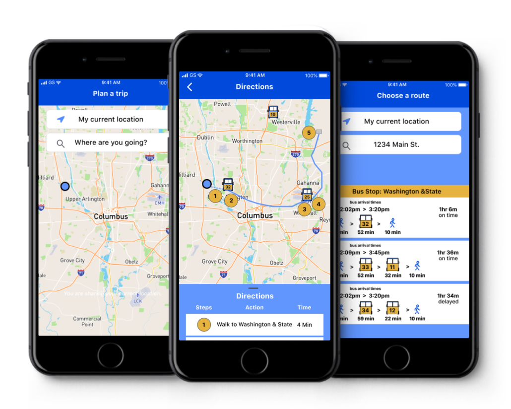
Solution: To design a mobile app to get the bus riders the information they need and to improve their user experience.
My Design Roles
UX Research
UI Design
Branding
Design Deliverables
User Surveys
Personas
Competitive Analysis
User Stories & Flows
Wireframes
Prototype
User Testing
Visual Design
Discovery
Competitive Analysis: I started this project with a discovery phase and a competitive analysis following the SWOT guidelines. I analyzed three of the top transit apps. Some of the common features were an easy onboarding process and an offer of multiple transportation options.
- Moovit was my favorite as it was easy to use and simple.
- Citymapper was easy to use but the fonts were a little small and not good for accessibility and the service is not available everywhere.
- Transit was my least favorite and was confusing with too many options.
I found some opportunities to improve the user experience by creating larger text and making my app simple and easy to use.
The COVID 19 pandemic was the main threat to the industry since fewer people were using public transportation.
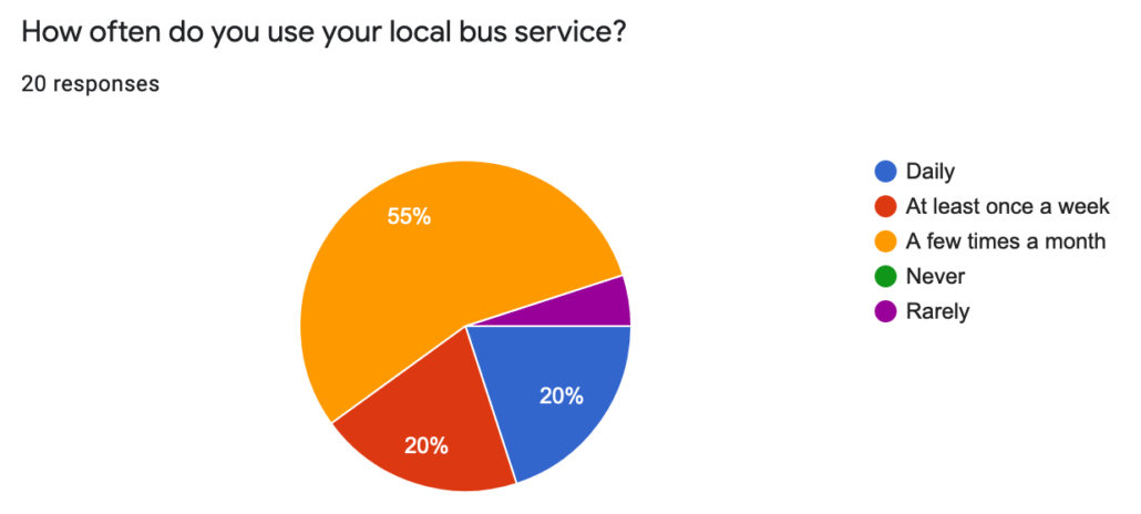
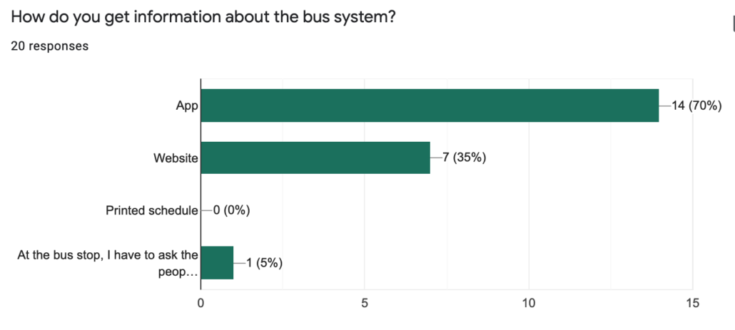
User Survey: My next step was to find out about the typical bus user. I created a survey using Google forms and got 20 qualified participants. Due to the time and budget constraints I wasn’t able to get the focused respondents that I wanted. The results that I received revealed that my survey respondents used their local bus system at least a few times a month and the most common way to get information about the bus system was with a mobile app.
User Interviews: Users interviews allowed me to understand more about the users needs and to get to know them. One of the biggest frustrations was not knowing when their bus would arrive. I learned that a bus tracker would be valuable to them as well as updated arrival times.
Personas:
Once I obtained my survey results I created personas. My personas were based on research to allow me to stay focused on my target audience. I took elements of the participants personalities and include them into my personas. For example I know that one participant has a dog and enjoys walking.
I created two personas based on my research. A young student with a part-time job who uses the bus daily. And a business professional who uses the bus once or twice a week.
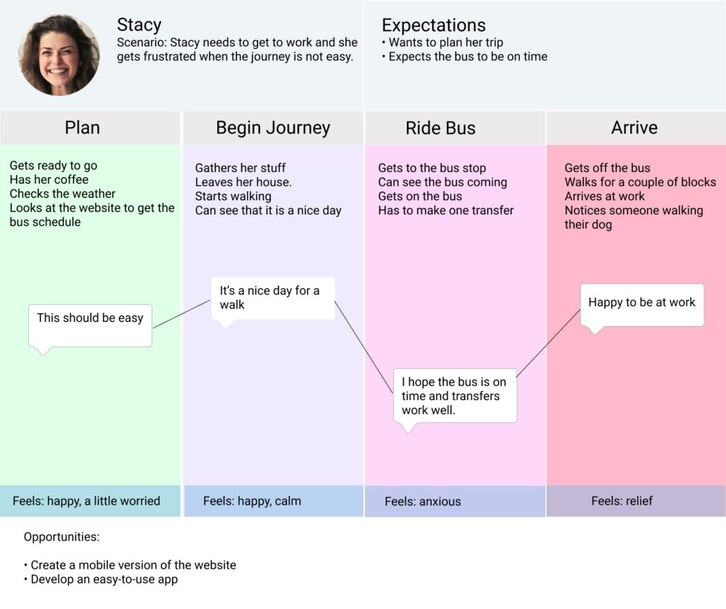
User Mapping: With the personas in mind I began to create user maps. These maps are used to empathize with the user and figure out how they might go about using the bus system. I learned how they might feel and act and also how a good app would help them navigate a trip.
Define
Information Architecture: The next step is the define phase. I began to create the information architecture to define how the user navigates through our product. To do this I created user stories. These stories were based on my user research and give me a place to start. I created specific tasks and ranked them in order of importance.
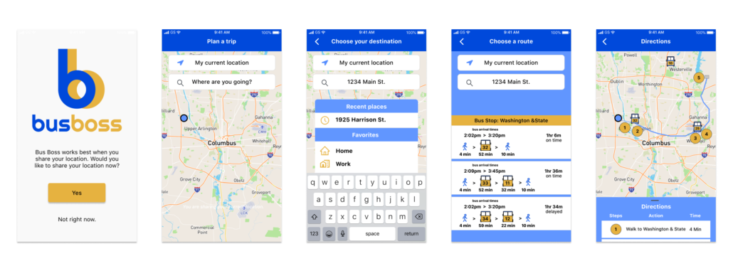
Wireframing: I started my wireframing process in Figma to allow easy feedback and testing. The initial wireframe was a paper and pencil sketch that I converted to a digital format. I was able to test an early version of the wireframe and created one more interaction based on the testing.
Develop
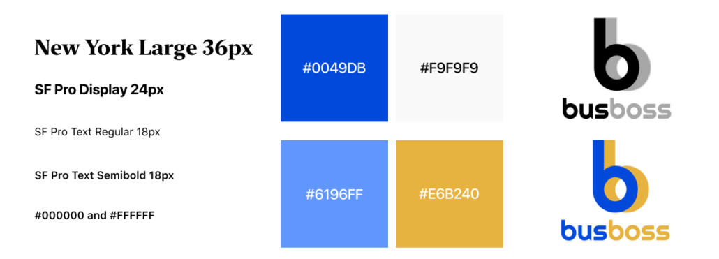
Visual Design: The visual design was based on the message that I wanted to convey to the users. It was based on the idea of a bus system being dependable, reliable, friendly and easy to use. I created my color palette using a blue as my main color and yellow as a secondary color with two more colors for highlights.
I used the WCAG tools to make sure my visual design was accessible to visually impaired users. The typefaces I used were the Apple recommended fonts to keep the design simple and clear. I used font sizes from 14px to 24 px.
I created a logo design using both the main and secondary colors. It is simple and easy to identify.
Deliver
Prototypes: Once my branding was one I developed prototypes. My prototypes were also created using Figma and I ended up with 4 iterations based on the testing results to create a simple user experience.
Conclusion and Learnings
I learned a lot from this project. Some of the things I learned are that I would do more research initially and also have more time to do user testing.
